
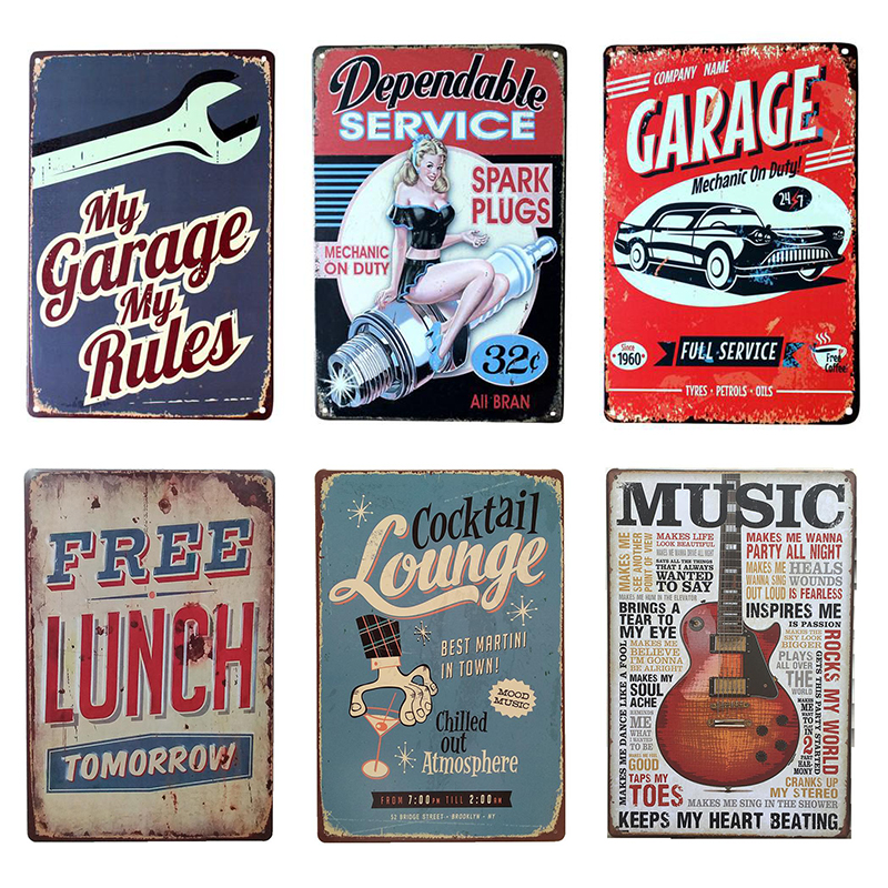
What exactly is a decorative sign? Is it simply any sign that prioritizes aesthetics over pure information dissemination? This seemingly straightforward query belies a complex interplay of design, functionality, and contextual appropriateness. We must delve into the nuances to truly understand the role and characteristics of decorative signage.
At its core, a decorative sign serves a dual purpose. It informs, yes, but it also enhances the visual environment in which it resides. The degree to which it prioritizes one over the other dictates its overall impact. A purely functional sign screams its message; a decorative sign whispers, inviting the viewer to engage on a more personal, aesthetic level.
The Quintessential Elements of Decorative Signage
Several elements coalesce to define a decorative sign. These are not mutually exclusive, but rather contribute synergistically to the overall effect.
1. Materiality and Texture: A Tactile Experience
Unlike standard, mass-produced signs often crafted from utilitarian materials like aluminum or basic plastics, decorative signs frequently employ a diverse palette of more evocative materials. Consider the warmth of reclaimed wood, the polished sheen of brass, or the rustic charm of hand-forged iron. The texture, too, plays a pivotal role. Embossed lettering, intricate carvings, or the rough grain of weathered timber all add depth and visual interest, inviting tactile exploration (though, of course, not always permitted!). The selection of materials often reflects the desired aesthetic – rustic, modern, vintage, or avant-garde. This careful consideration elevates the sign from a mere marker to an integral component of the surrounding décor.
2. Typography and Lettering: The Art of Visual Communication
The choice of typeface is paramount. A decorative sign eschews the ubiquitous Arial or Times New Roman in favor of fonts that possess character and personality. Serifs can evoke a sense of tradition and elegance, while sans-serif fonts lean towards a more contemporary and minimalist aesthetic. Hand-lettering, with its inherent imperfections and bespoke quality, adds a uniquely artisanal touch. The kerning (the spacing between letters) and leading (the spacing between lines) are meticulously adjusted to achieve optimal readability and visual harmony. Color choices for the lettering are also critical, often contrasting with the background to ensure legibility while simultaneously contributing to the overall aesthetic.
3. Embellishment and Ornamentation: Adding Flourish and Finesse
Decorative signs often incorporate embellishments that go beyond the strictly necessary. This could include intricate borders, stylized flourishes, or even small sculptural elements. Gilding, with its shimmering opulence, can add a touch of luxury. Painted motifs, ranging from simple geometric patterns to elaborate landscapes, can further enhance the visual appeal. The key is to strike a balance; the embellishments should complement the message without overwhelming it. A surfeit of ornamentation can lead to visual clutter and detract from the sign’s primary function.
4. Contextual Harmony: Seamless Integration with the Environment
A truly successful decorative sign is one that integrates seamlessly with its surroundings. The style, materials, and overall aesthetic should be congruent with the architectural style, the brand identity (if applicable), and the overall ambiance of the location. A brightly colored, modern sign might look jarring in a historic district, while a rustic wooden sign might feel out of place in a sleek, minimalist office. Careful consideration of the context is essential to ensure that the sign enhances, rather than detracts from, the overall visual experience.
The Subtleties of Functionality
While aesthetics are paramount, functionality cannot be entirely disregarded. A decorative sign must still be legible and easily understood. The size of the lettering, the contrast between the text and the background, and the placement of the sign are all crucial factors that affect its usability. A beautifully designed sign that is difficult to read is ultimately ineffective. The challenge lies in striking a balance between aesthetic appeal and practical utility. The information conveyed must be presented in a clear and concise manner, even as the sign strives to be visually captivating.
Navigating the Pitfalls: Avoiding Common Missteps
The creation of effective decorative signage is fraught with potential pitfalls. Over-designing, neglecting legibility, and failing to consider the contextual environment are all common mistakes. A sign that is too busy or cluttered can be visually overwhelming and difficult to decipher. A sign that is illegible, regardless of its aesthetic appeal, fails to serve its primary purpose. A sign that clashes with its surroundings can detract from the overall visual experience and create a sense of disharmony. Avoiding these pitfalls requires careful planning, meticulous attention to detail, and a deep understanding of the principles of design.
Beyond Simple Utility: The Power of Affective Design
Decorative signs transcend mere information delivery; they evoke emotions, create atmosphere, and contribute to the overall sense of place. A well-designed decorative sign can transform a mundane space into a memorable one, enhancing the user experience and leaving a lasting impression. They can signal a business’s brand identity, contribute to a community’s aesthetic charm, and even subtly influence behavior. By prioritizing aesthetics without completely sacrificing functionality, decorative signs elevate the art of visual communication to a new level, demonstrating the power of affective design.


Leave a Comment